

Risk & Compliance Platform
Acuity, a risk and compliance product with complex workflows and a large amount of data
The problem
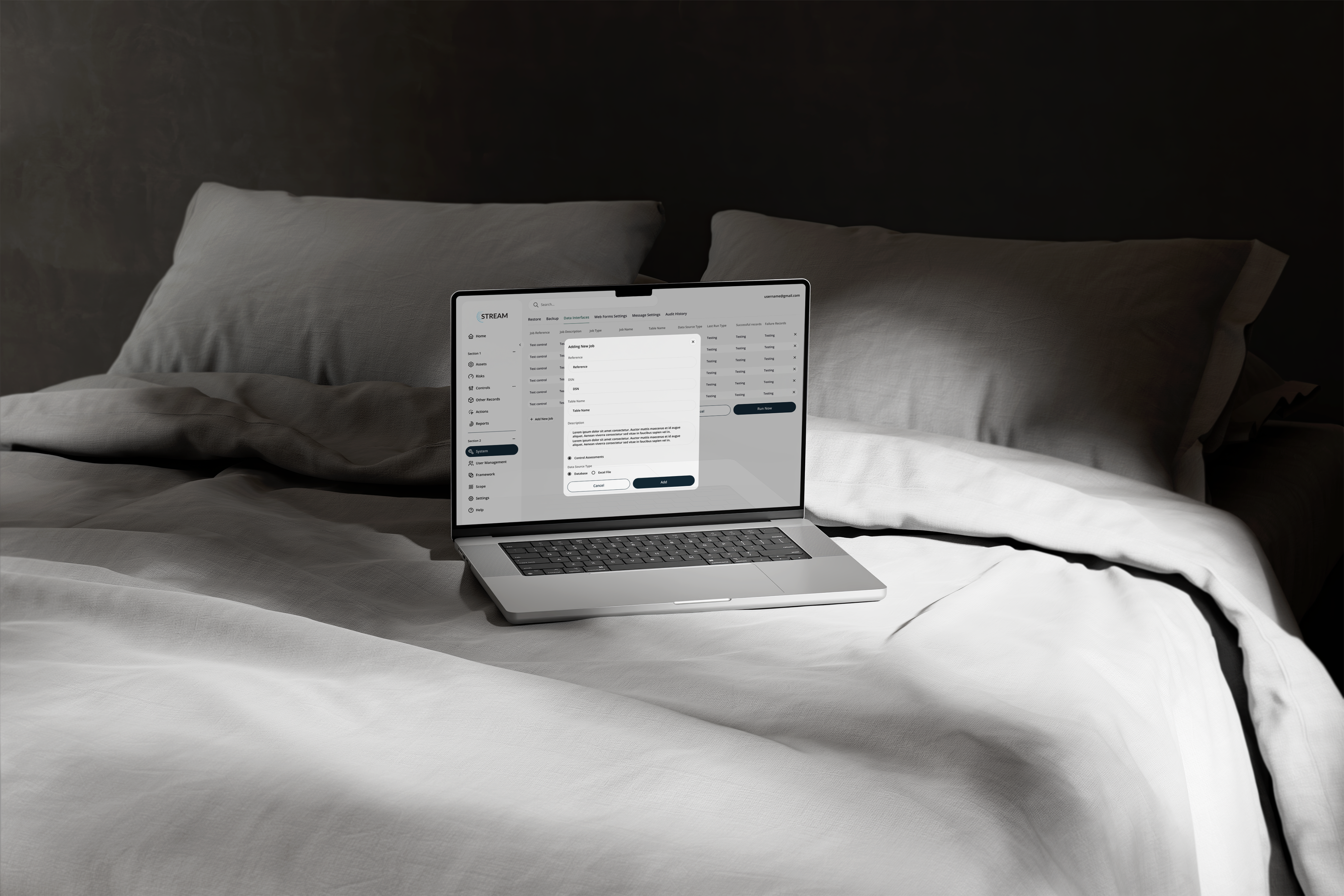
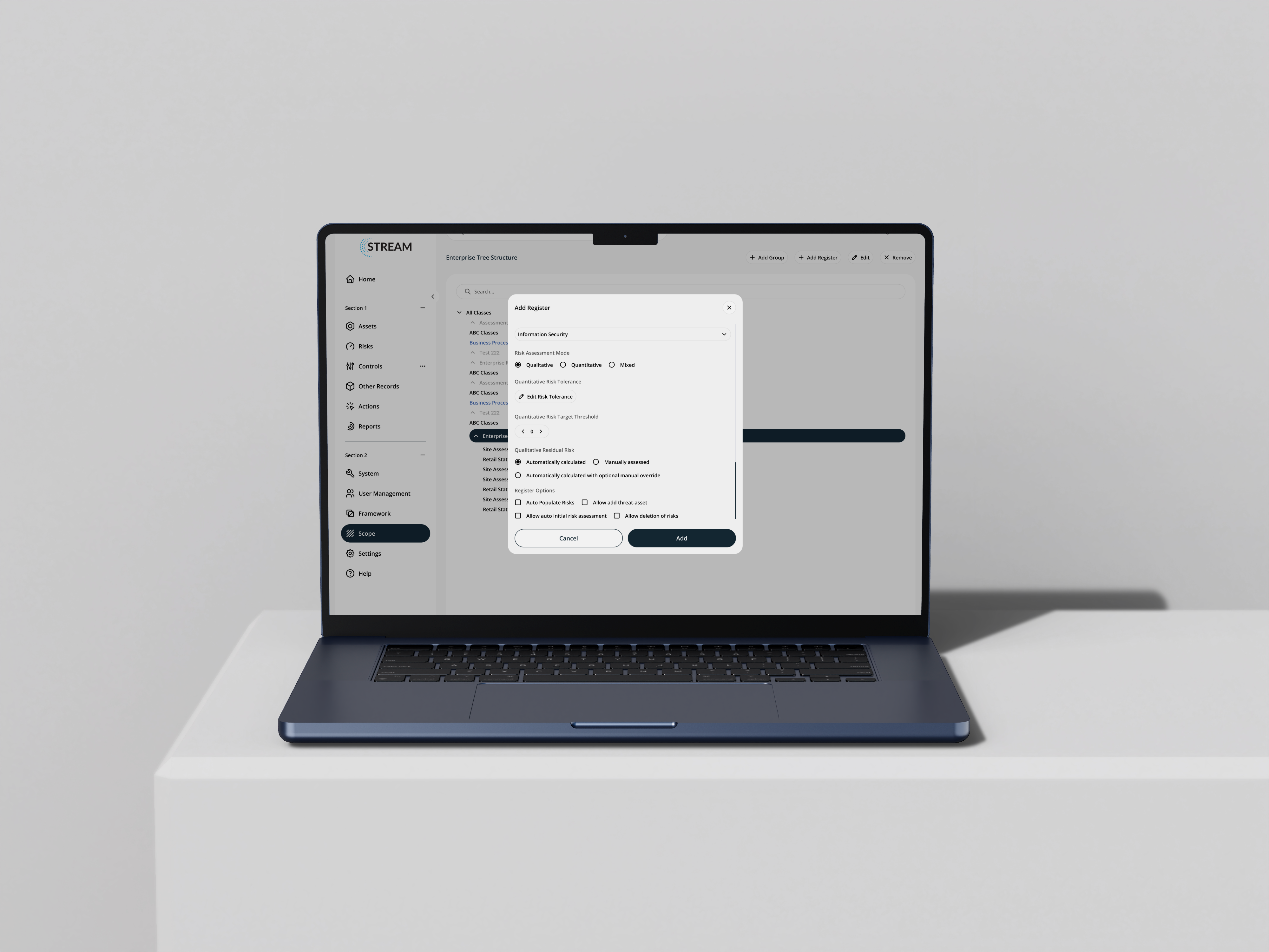
Acuity's STREAM platform manages cyber risk and regulatory compliance across frameworks including ISO 27001, NIST, and PCI-DSS. The underlying capability was strong, but the interface required significant effort to navigate - dense tables with no clear hierarchy, inconsistent status indicators, and a weekly reporting flow that took 11 manual steps. Experienced users had built workarounds. New team members took a long time to become independent.

The goal: Make a data-heavy, high-stakes dashboard genuinely readable. Not a visual refresh - a structural redesign grounded in how compliance professionals actually work.
Heuristic evaluation
A heuristic evaluation of the existing platform identified 31 usability violations across the interface. The most significant were around consistency - the same risk status appeared in different colours depending on which screen you were on — and recognition versus recall, with users required to hold too much context in mind between screens.
Research
I read through 60+ reviews on G2 and Capterra, tagging by theme. Three things came up consistently: the platform was capable but hard to navigate, reporting demanded too much manual effort, and onboarding new team members took longer than it should. I followed that with a card sorting exercise with 18 compliance professionals online, which revealed that the existing information architecture didn't reflect how users naturally grouped and prioritised risk information. The navigation was restructured before a single component was touched.
A timed task benchmark - 5 tasks, 9 users, no assistance - gave me the baseline numbers to design against.
Wireframes
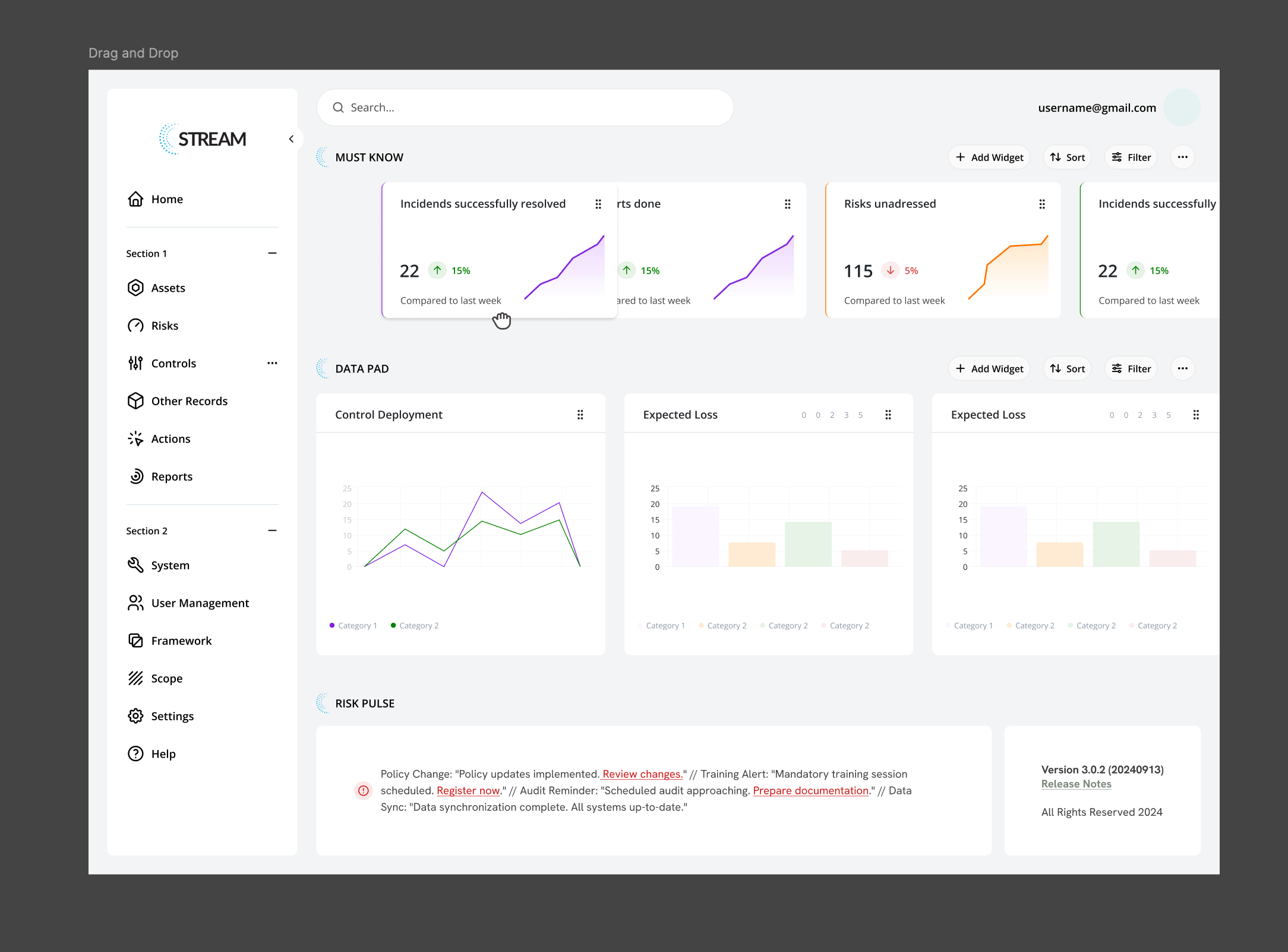
The dashboard rebuilt around three questions every user had at the start of every session: what is critical right now, what is the compliance status across frameworks, and what requires action today. Those became the three zones of the redesigned dashboard, in that order.
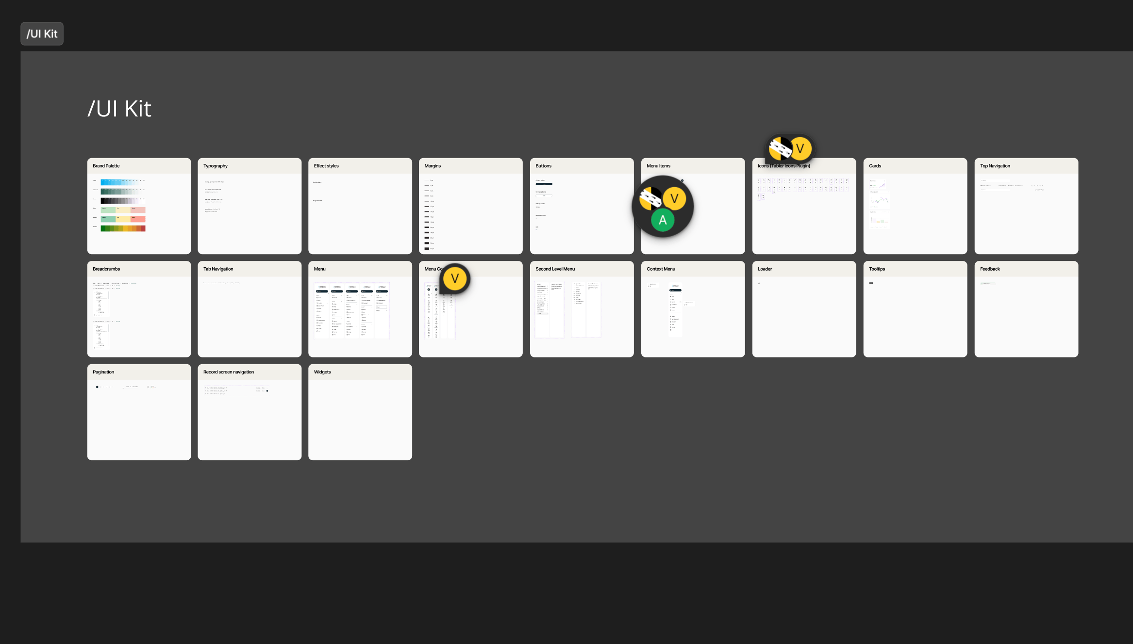
Design system
One principle held everything together: four colour tokens applied consistently across the entire platform. Critical/Red. High/Amber. Moderate/Yellow. Low/Green. On every table, badge, and chart, without exception. For professionals reading high-density data under pressure, that level of consistency reduces cognitive load in ways that are genuinely meaningful.
Usability study
Same 9 participants, same 5 tasks, directly comparable. Every task improved by approximately 80%. Task completion rate moved from an average of 6.5 out of 9 to 9 out of 9.
Solution
A dashboard where the layout carries the cognitive weight so the user doesn't have to. One post-launch review read: "Finally feels like it was designed for the people using it." That was the aim from the beginning.

Portfolio
CRM Development Website

Wellness & fitness mobile app
Commercial website for a restaurant
Risk & Compliance Platform
Acuity, a risk and compliance product with complex workflows and a large amount of data
The problem
Acuity's STREAM platform manages cyber risk and regulatory compliance across frameworks including ISO 27001, NIST, and PCI-DSS. The underlying capability was strong, but the interface required significant effort to navigate - dense tables with no clear hierarchy, inconsistent status indicators, and a weekly reporting flow that took 11 manual steps. Experienced users had built workarounds. New team members took a long time to become independent.

The goal: Make a data-heavy, high-stakes dashboard genuinely readable. Not a visual refresh - a structural redesign grounded in how compliance professionals actually work.
Heuristic evaluation
A heuristic evaluation of the existing platform identified 31 usability violations across the interface. The most significant were around consistency - the same risk status appeared in different colours depending on which screen you were on — and recognition versus recall, with users required to hold too much context in mind between screens.
Research
I read through 60+ reviews on G2 and Capterra, tagging by theme. Three things came up consistently: the platform was capable but hard to navigate, reporting demanded too much manual effort, and onboarding new team members took longer than it should. I followed that with a card sorting exercise with 18 compliance professionals online, which revealed that the existing information architecture didn't reflect how users naturally grouped and prioritised risk information. The navigation was restructured before a single component was touched.
A timed task benchmark - 5 tasks, 9 users, no assistance - gave me the baseline numbers to design against.
Wireframes
The dashboard rebuilt around three questions every user had at the start of every session: what is critical right now, what is the compliance status across frameworks, and what requires action today. Those became the three zones of the redesigned dashboard, in that order.
Design system
One principle held everything together: four colour tokens applied consistently across the entire platform. Critical/Red. High/Amber. Moderate/Yellow. Low/Green. On every table, badge, and chart, without exception. For professionals reading high-density data under pressure, that level of consistency reduces cognitive load in ways that are genuinely meaningful.
Usability study
Same 9 participants, same 5 tasks, directly comparable. Every task improved by approximately 80%. Task completion rate moved from an average of 6.5 out of 9 to 9 out of 9.
Solution
A dashboard where the layout carries the cognitive weight so the user doesn't have to. One post-launch review read: "Finally feels like it was designed for the people using it." That was the aim from the beginning.

Portfolio
CRM Development Website
Wellness & fitness mobile app
Commercial website for a restaurant


Risk & Compliance Platform
Acuity, a risk and compliance product with complex workflows and a large amount of data
The problem
Acuity's STREAM platform manages cyber risk and regulatory compliance across frameworks including ISO 27001, NIST, and PCI-DSS. The underlying capability was strong, but the interface required significant effort to navigate - dense tables with no clear hierarchy, inconsistent status indicators, and a weekly reporting flow that took 11 manual steps. Experienced users had built workarounds. New team members took a long time to become independent.
The goal: Make a data-heavy, high-stakes dashboard genuinely readable. Not a visual refresh - a structural redesign grounded in how compliance professionals actually work.
Heuristic evaluation
A heuristic evaluation of the existing platform identified 31 usability violations across the interface. The most significant were around consistency - the same risk status appeared in different colours depending on which screen you were on — and recognition versus recall, with users required to hold too much context in mind between screens.
Research
I read through 60+ reviews on G2 and Capterra, tagging by theme. Three things came up consistently: the platform was capable but hard to navigate, reporting demanded too much manual effort, and onboarding new team members took longer than it should. I followed that with a card sorting exercise with 18 compliance professionals online, which revealed that the existing information architecture didn't reflect how users naturally grouped and prioritised risk information. The navigation was restructured before a single component was touched.
A timed task benchmark - 5 tasks, 9 users, no assistance - gave me the baseline numbers to design against.
Wireframes
The dashboard rebuilt around three questions every user had at the start of every session: what is critical right now, what is the compliance status across frameworks, and what requires action today. Those became the three zones of the redesigned dashboard, in that order.
Design system
One principle held everything together: four colour tokens applied consistently across the entire platform. Critical/Red. High/Amber. Moderate/Yellow. Low/Green. On every table, badge, and chart, without exception. For professionals reading high-density data under pressure, that level of consistency reduces cognitive load in ways that are genuinely meaningful.
Usability study
Same 9 participants, same 5 tasks, directly comparable. Every task improved by approximately 80%. Task completion rate moved from an average of 6.5 out of 9 to 9 out of 9.
Solution
A dashboard where the layout carries the cognitive weight so the user doesn't have to. One post-launch review read: "Finally feels like it was designed for the people using it." That was the aim from the beginning.
Portfolio
CRM Development Website
Wellness & fitness mobile app
Commercial website for a restaurant