

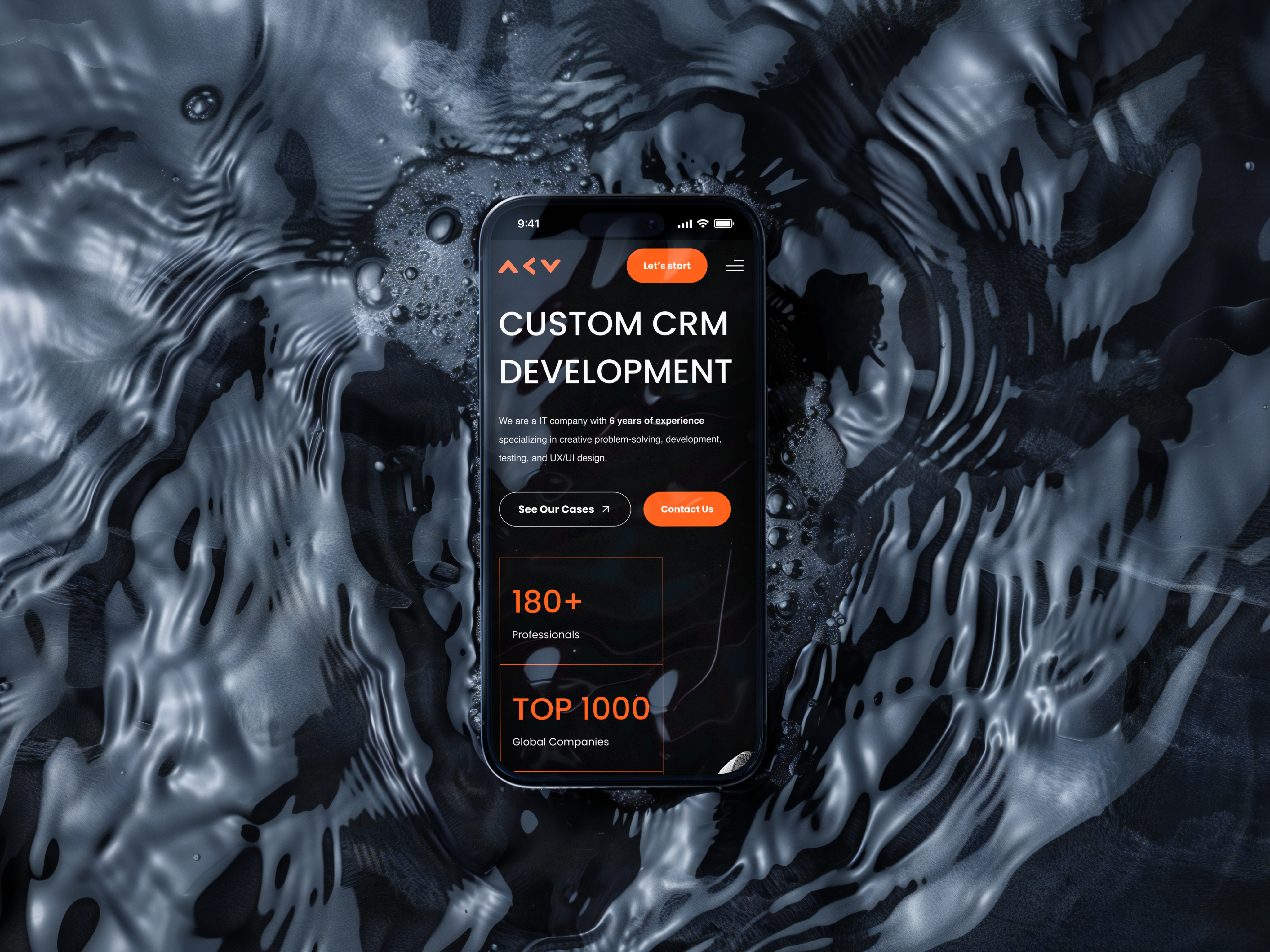
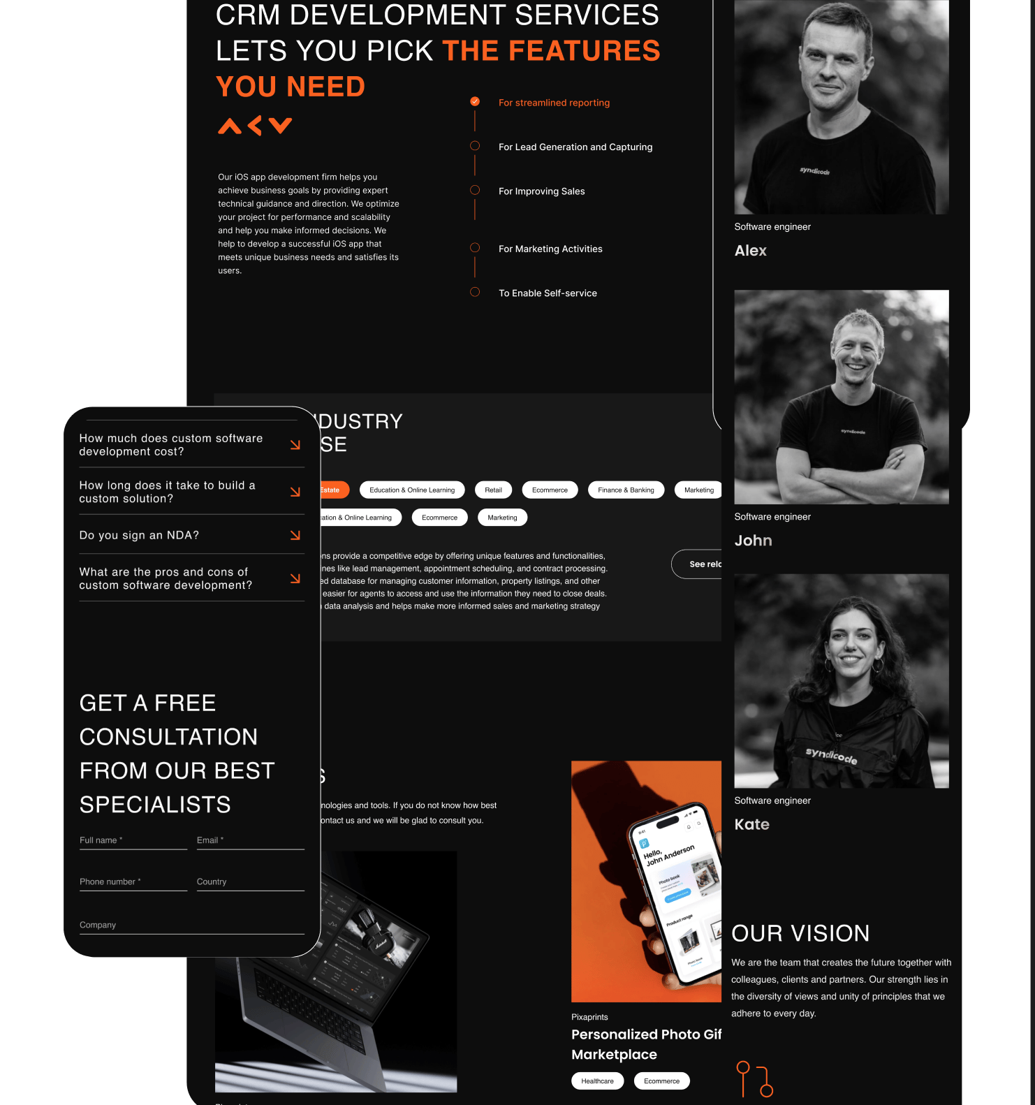
CRM Services Website
A strong service offering needed a web presence that could open doors
The problem
The business had grown entirely through referrals, with no website at all. That model had taken them far - but the ceiling was real, and expanding beyond an existing network required something that could represent the product without someone behind it doing the explaining.

The goal: Build a website that handles the first part of the sales conversation. By the time someone reaches out, they should already understand the value and feel confident about it.
Competitive analysis
I started with a competitive analysis of eight CRM service websites, mapping how each one structured its proposition, handled trust signals, and guided visitors toward conversion. The consistent gap across all of them was copy written for people already familiar with the category — leaving the undecided visitor without a clear reason to stay.
Concepts
I ran 5-second tests on three homepage concepts with 25 people matching the target buyer profile. One concept scored 19 out of 20 on clarity of proposition. That gave me a confident starting point.
Research online
Search intent analysis shaped the copy structure significantly. The language people actually used when searching for this kind of solution was different from how the service had been described internally — and that gap mattered. An online card sorting exercise with 20 participants restructured the services section entirely, since people grouped the offering differently to how the team had assumed.
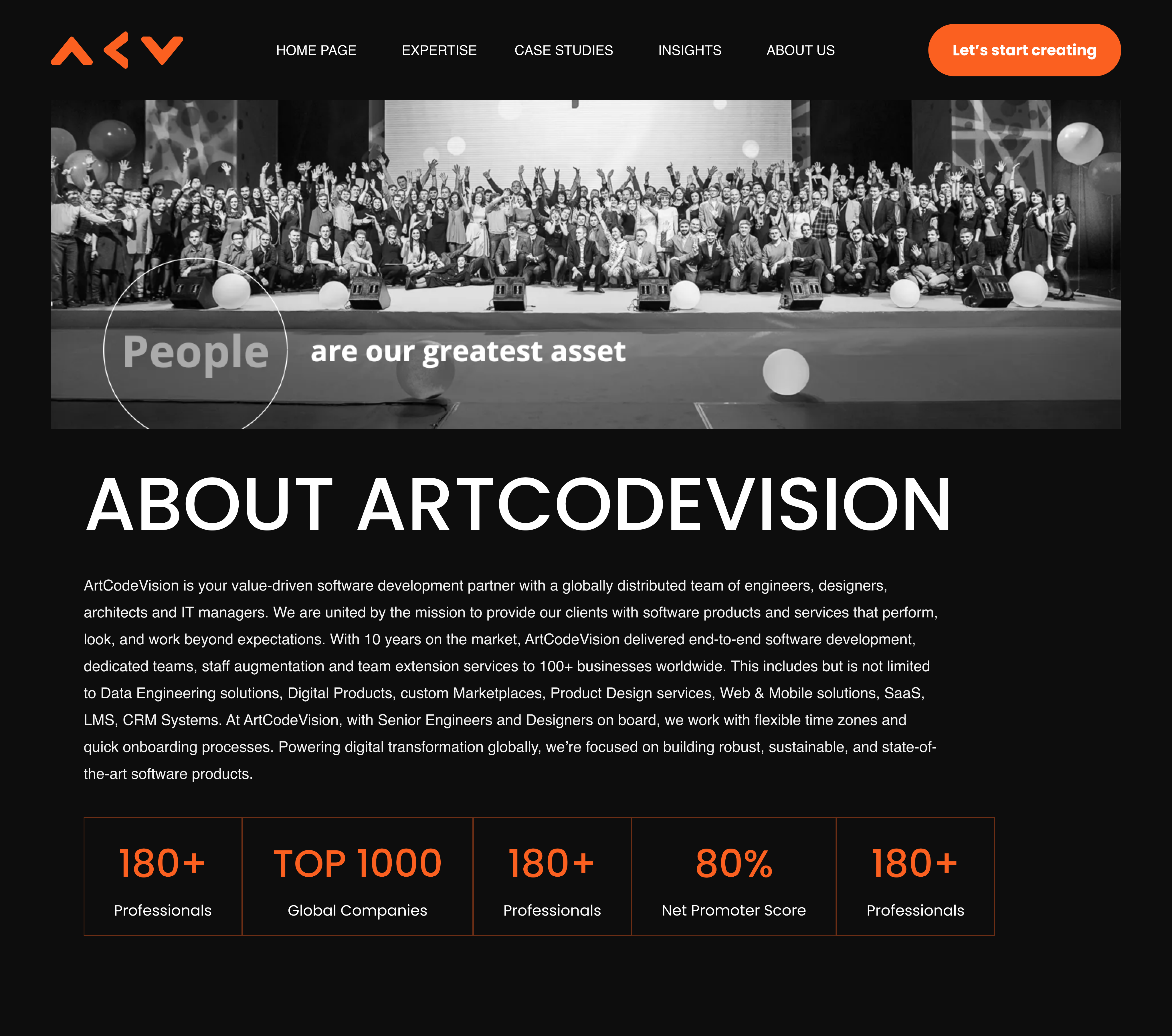
Design system
Considered and direct. Credible enough for technical buyers, accessible enough for the decision-makers who weren't. One typeface, two weights, a single accent colour used only on calls to action. Seven components across the entire site - every page a different composition of the same elements.
Numbers
Monthly leads: 0 → 47
Demo bookings: 0 → 19 per month
Bounce rate settled at 41%
Average time on site: 3m 12s
Proposition clarity (5-sec test): 19/20
6 new inbound clients closed in Q1
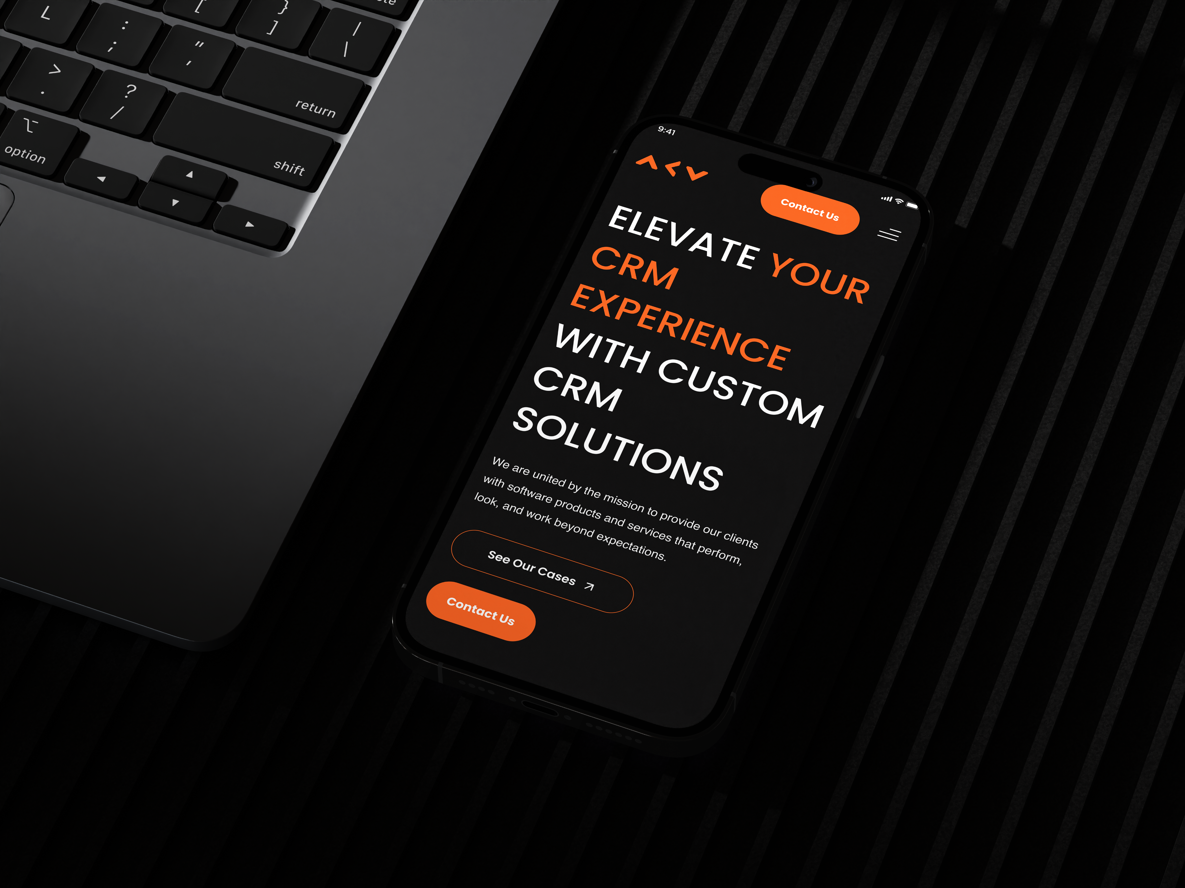
Solution
Three entry points matched to three different visitor intentions - ready to commit, exploring options, or still assessing value. Every path closes clearly. The sales team moved from generating all leads themselves to managing inbound ones.

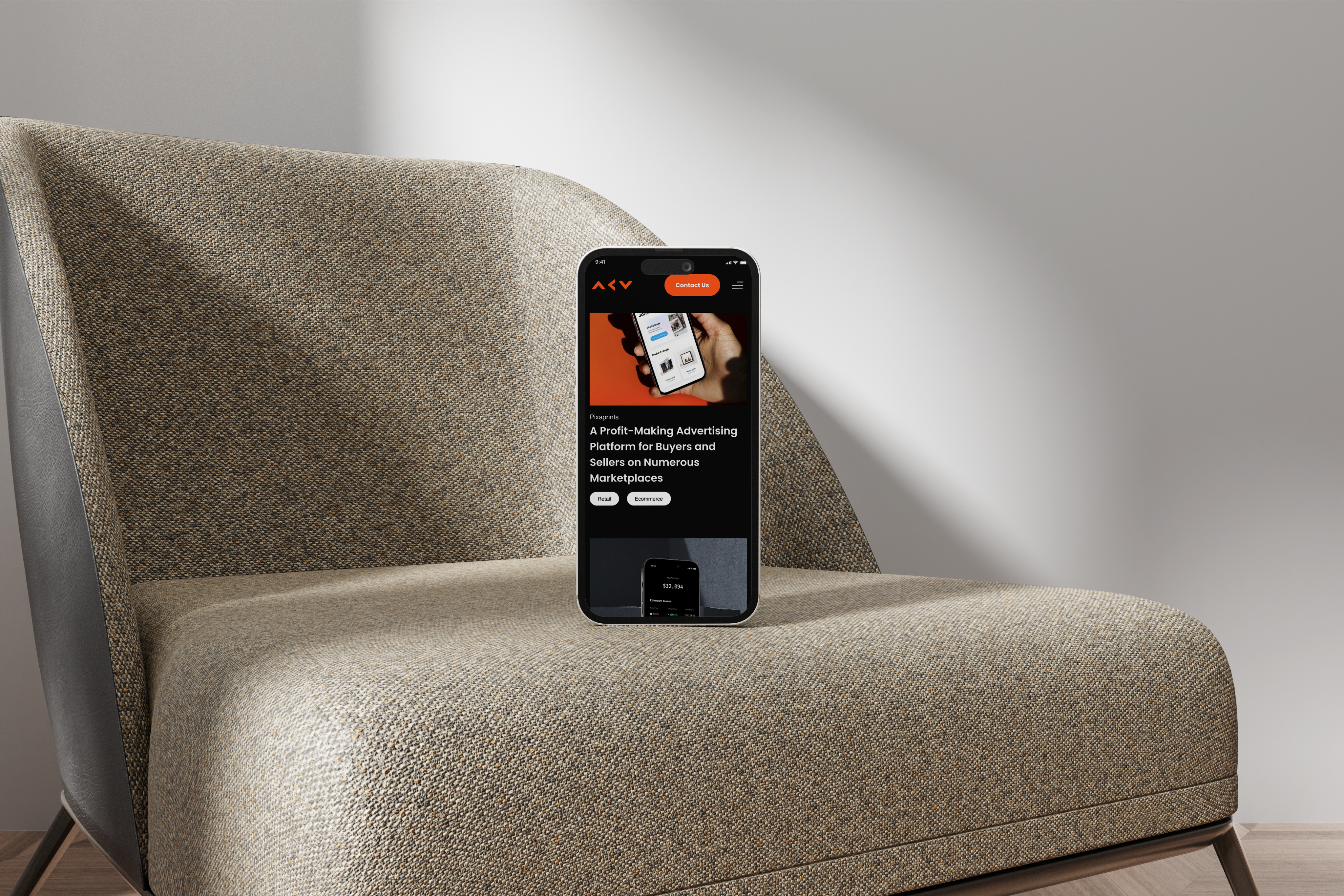
Portfolio

Risk & Compliance Platform

Finance & Invoicing App
Financial App
CRM Services Website
A strong service offering needed a web presence that could open doors
The problem
The business had grown entirely through referrals, with no website at all. That model had taken them far - but the ceiling was real, and expanding beyond an existing network required something that could represent the product without someone behind it doing the explaining.

The goal: Build a website that handles the first part of the sales conversation. By the time someone reaches out, they should already understand the value and feel confident about it.
Competitive analysis
I started with a competitive analysis of eight CRM service websites, mapping how each one structured its proposition, handled trust signals, and guided visitors toward conversion. The consistent gap across all of them was copy written for people already familiar with the category — leaving the undecided visitor without a clear reason to stay.
Concepts
I ran 5-second tests on three homepage concepts with 25 people matching the target buyer profile. One concept scored 19 out of 20 on clarity of proposition. That gave me a confident starting point.
Research online
Search intent analysis shaped the copy structure significantly. The language people actually used when searching for this kind of solution was different from how the service had been described internally — and that gap mattered. An online card sorting exercise with 20 participants restructured the services section entirely, since people grouped the offering differently to how the team had assumed.
Design system
Considered and direct. Credible enough for technical buyers, accessible enough for the decision-makers who weren't. One typeface, two weights, a single accent colour used only on calls to action. Seven components across the entire site - every page a different composition of the same elements.
Numbers
Monthly leads: 0 → 47
Demo bookings: 0 → 19 per month
Bounce rate settled at 41%
Average time on site: 3m 12s
Proposition clarity (5-sec test): 19/20
6 new inbound clients closed in Q1
Solution
Three entry points matched to three different visitor intentions - ready to commit, exploring options, or still assessing value. Every path closes clearly. The sales team moved from generating all leads themselves to managing inbound ones.

Portfolio
Risk & Compliance Platform
Finance & Invoicing App
Financial App


CRM Services Website
A strong service offering needed a web presence that could open doors
The problem
The business had grown entirely through referrals, with no website at all. That model had taken them far - but the ceiling was real, and expanding beyond an existing network required something that could represent the product without someone behind it doing the explaining.
The goal: Build a website that handles the first part of the sales conversation. By the time someone reaches out, they should already understand the value and feel confident about it.
Competitive analysis
I started with a competitive analysis of eight CRM service websites, mapping how each one structured its proposition, handled trust signals, and guided visitors toward conversion. The consistent gap across all of them was copy written for people already familiar with the category — leaving the undecided visitor without a clear reason to stay.
Concepts
I ran 5-second tests on three homepage concepts with 25 people matching the target buyer profile. One concept scored 19 out of 20 on clarity of proposition. That gave me a confident starting point.
Research online
Search intent analysis shaped the copy structure significantly. The language people actually used when searching for this kind of solution was different from how the service had been described internally — and that gap mattered. An online card sorting exercise with 20 participants restructured the services section entirely, since people grouped the offering differently to how the team had assumed.
Design system
Considered and direct. Credible enough for technical buyers, accessible enough for the decision-makers who weren't. One typeface, two weights, a single accent colour used only on calls to action. Seven components across the entire site - every page a different composition of the same elements.
Numbers
Monthly leads: 0 → 47
Demo bookings: 0 → 19 per month
Bounce rate settled at 41%
Average time on site: 3m 12s
Proposition clarity (5-sec test): 19/20
6 new inbound clients closed in Q1
Solution
Three entry points matched to three different visitor intentions - ready to commit, exploring options, or still assessing value. Every path closes clearly. The sales team moved from generating all leads themselves to managing inbound ones.
Portfolio
Risk & Compliance Platform
Finance & Invoicing App
Financial App