

French Holidays · Restaurant & Pastry · Website + Personal Account Dashboard
A restaurant with real character needed a digital presence
The problem
There was no functional website to speak of - the menu was a PDF, there was no reservation flow, and the contact form was doing work it was never designed to do. On top of that, loyal customers were accumulating loyalty points with no way to see or use them, because that information existed nowhere in the product.

The goal: Simplify the core booking flow and bring creche into the app as a proper, native feature - connected to the class booking rather than sitting outside it.
Competitive analysis
I ran a competitive analysis across 12 restaurant websites, looking at how the strongest ones handled atmosphere, reservations, and trust-building in the first few seconds. I followed that with a 5-second test on three early homepage concepts with 30 people - asking simply whether each one made them want to visit. The results pointed clearly toward one direction.
Research
For the dashboard, I surveyed 45 registered customers about the loyalty programme. 71% had never looked for their balance - not from lack of interest, but because nothing in the experience had ever pointed them to it. Unmoderated usability testing on the existing site through Maze showed the reservation task completing at just 28%. That became the benchmark.
Wireframes
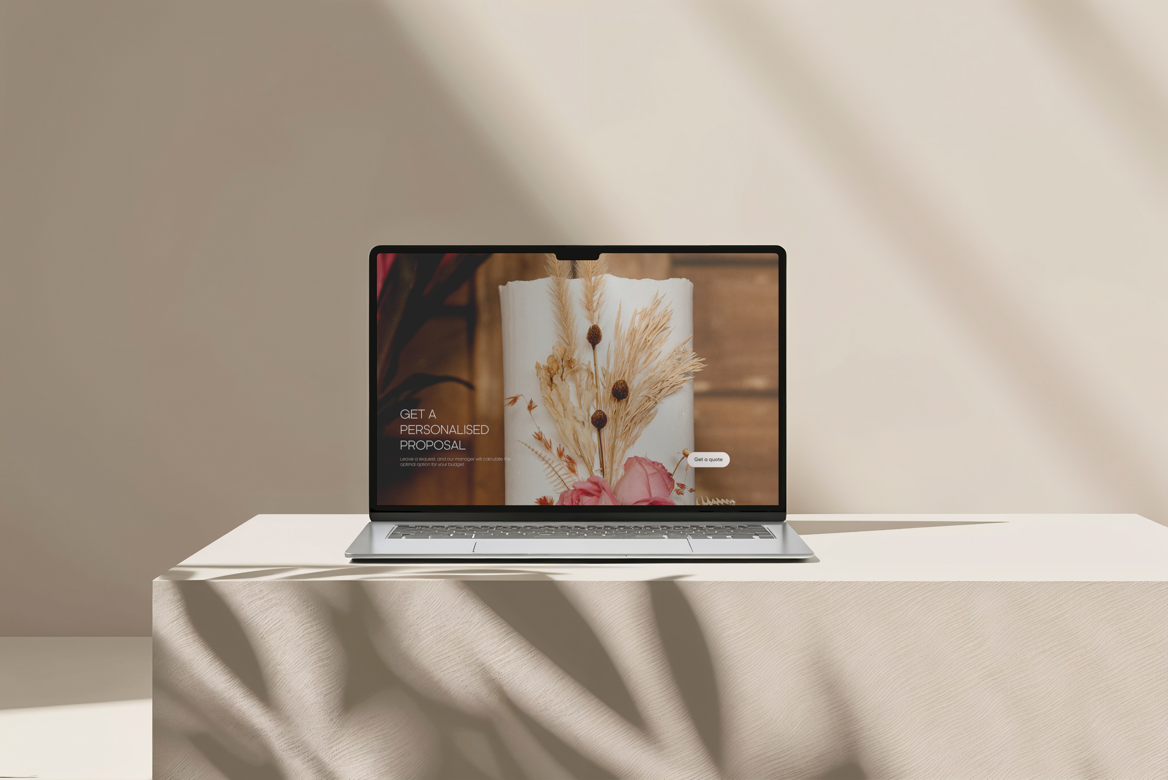
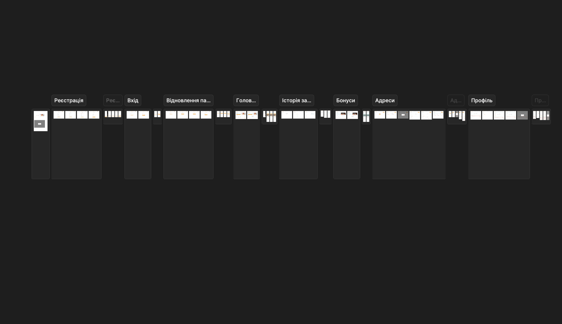
Six screens built and tested before any visual decisions were made. Every participant looked for the reservation CTA in the hero section rather than the navigation. It moved there immediately.
Design system
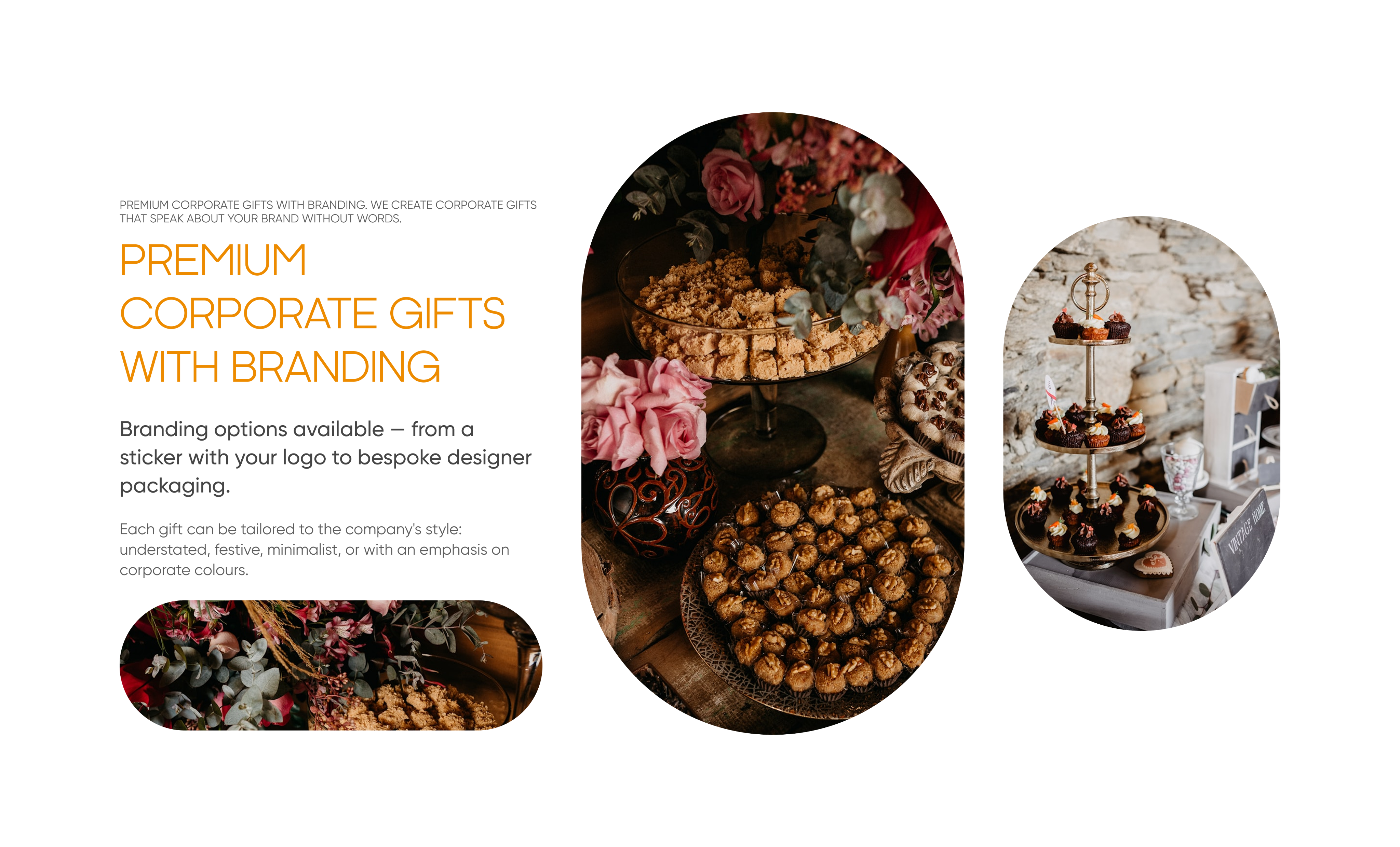
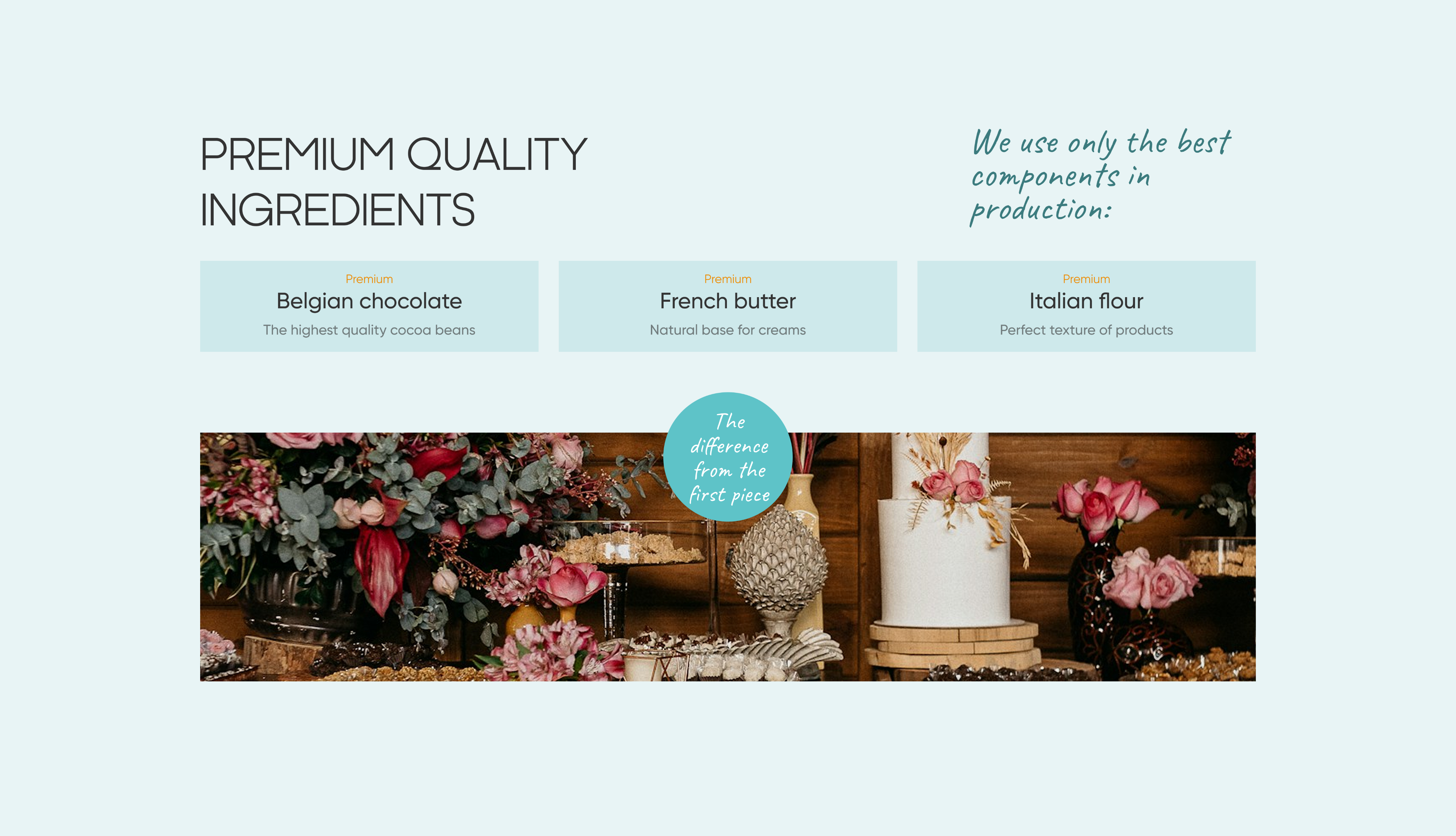
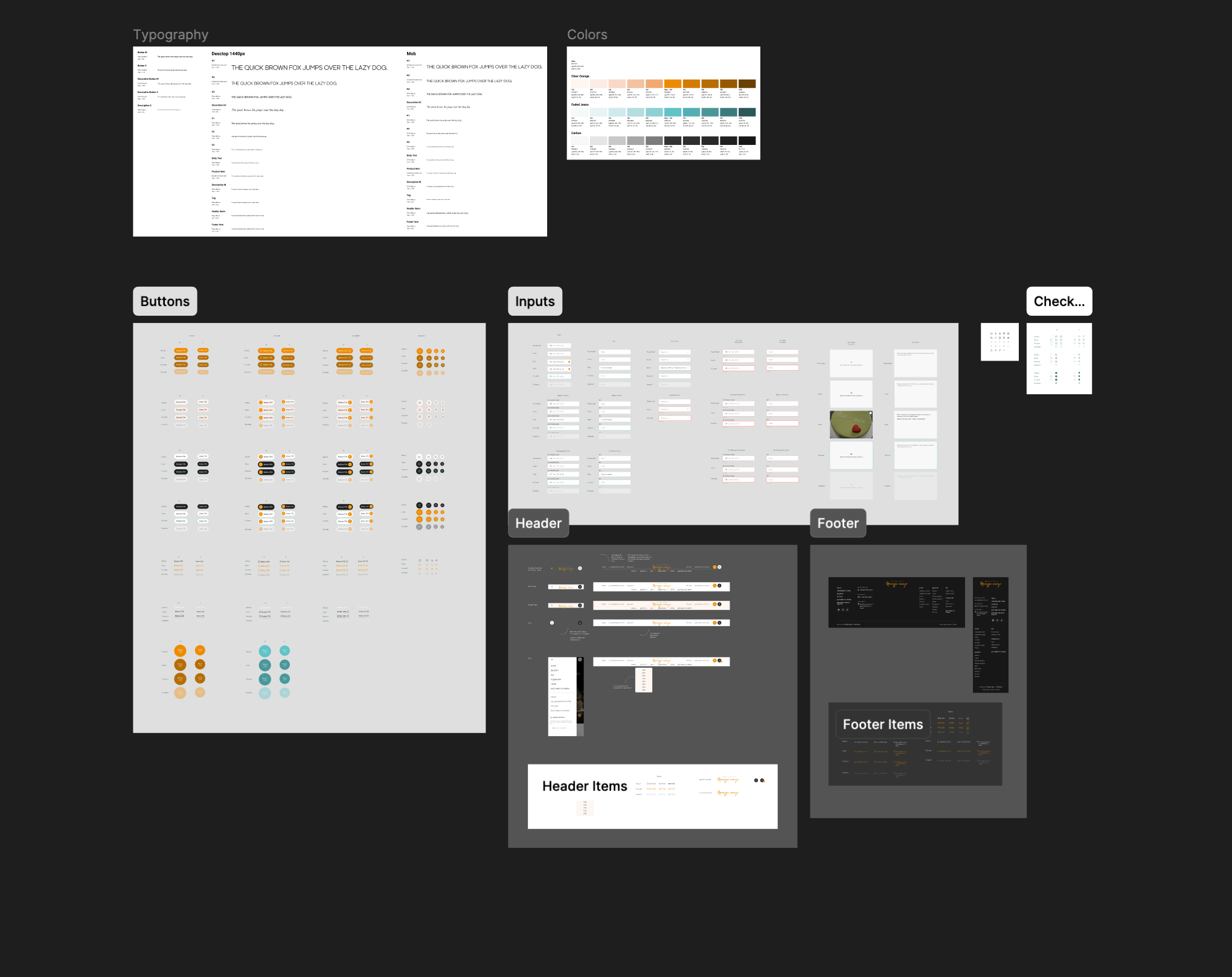
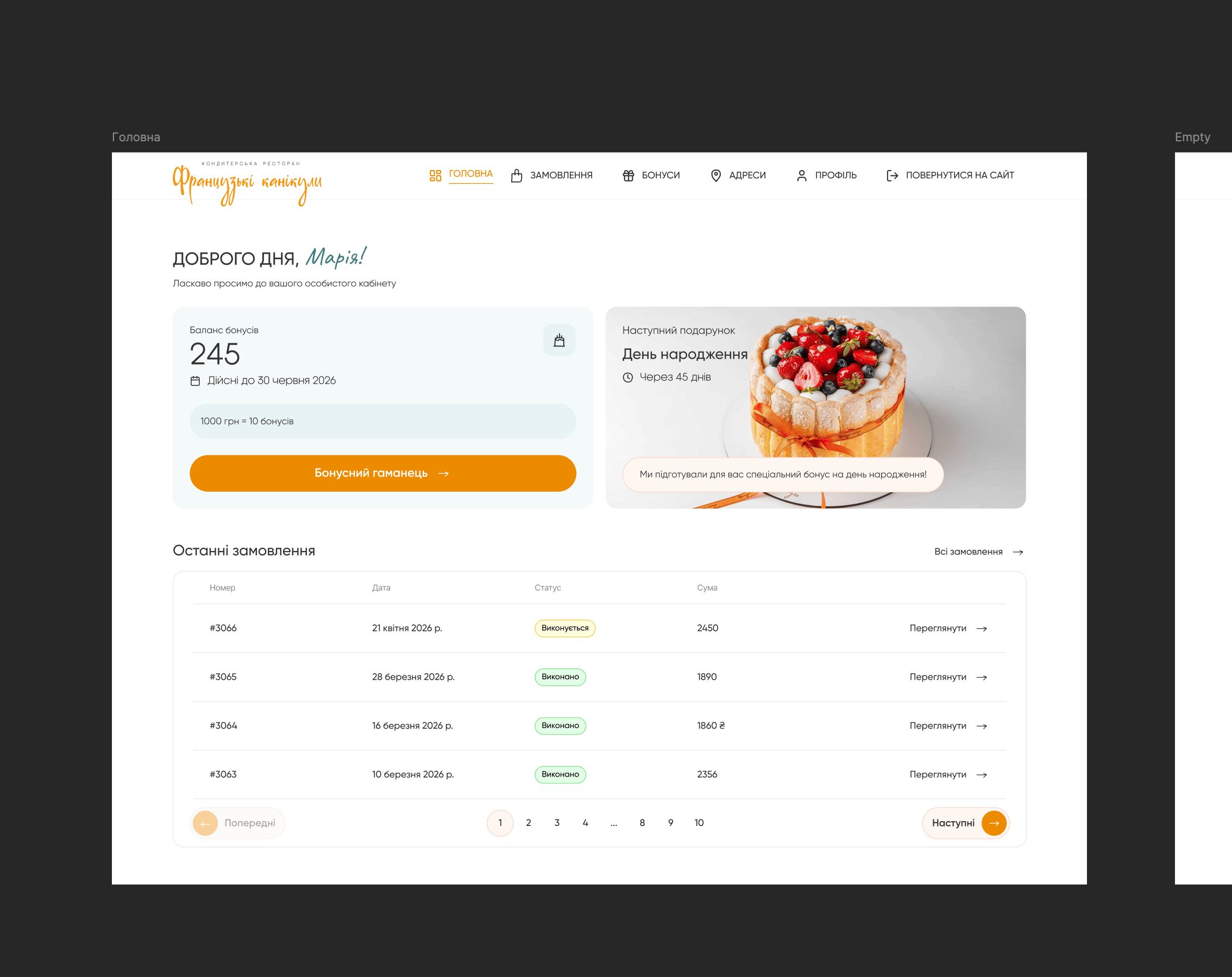
Cormorant Garamond for character and atmosphere, Inter for functional clarity. The colour palette was drawn from the restaurant itself - warm linen, terracotta, candlelight tones. The personal dashboard extended the same visual language: order history cards, a visual bonus wallet, loyalty tier status. The goal was for it to feel like a natural extension of the restaurant rather than a separate utility.
Usability study
Reservation task completion went from 28% to 91%. Dashboard testing revealed that customers spent considerable time browsing their order history - more than expected - which indicated genuine engagement rather than just utility.
Numbers
Reservation completion 28% → 91%
Bounce rate 68% → 39%
Loyalty programme awareness 31% → 74%
Dashboard return rate in first 60 days: 62%
5-second desirability score: 6/30 → 24/30
Solution
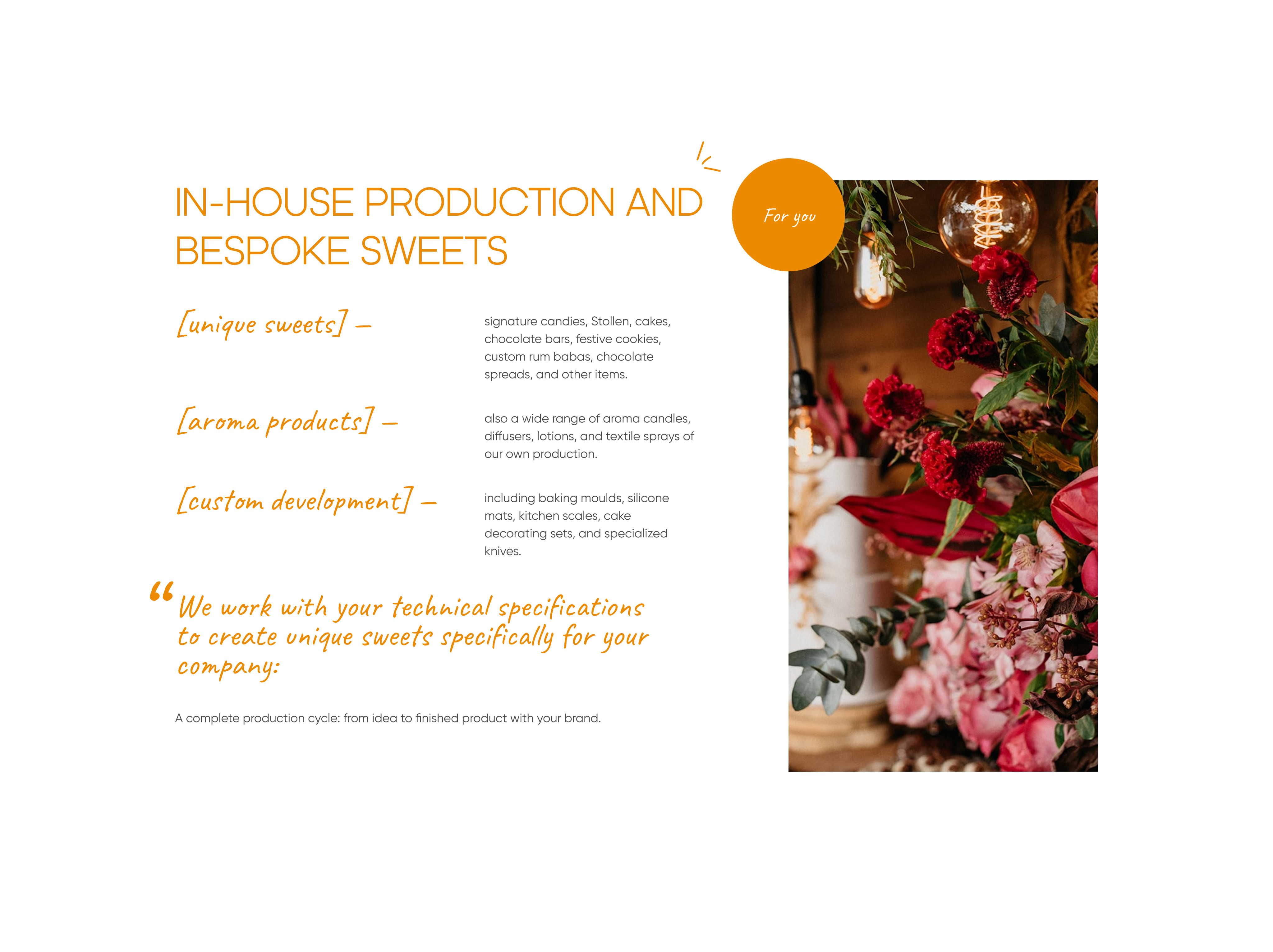
A website that communicates the experience before anyone walks through the door.
A dashboard that gives loyal customers visibility into something they'd earned but never been shown.

Portfolio
Risk & Compliance Platform

Finance & Invoicing App
Financial App
French Holidays · Restaurant & Pastry · Website + Personal Account Dashboard
A restaurant with real character needed a digital presence
The problem
There was no functional website to speak of - the menu was a PDF, there was no reservation flow, and the contact form was doing work it was never designed to do. On top of that, loyal customers were accumulating loyalty points with no way to see or use them, because that information existed nowhere in the product.

The goal: Simplify the core booking flow and bring creche into the app as a proper, native feature - connected to the class booking rather than sitting outside it.
Competitive analysis
I ran a competitive analysis across 12 restaurant websites, looking at how the strongest ones handled atmosphere, reservations, and trust-building in the first few seconds. I followed that with a 5-second test on three early homepage concepts with 30 people - asking simply whether each one made them want to visit. The results pointed clearly toward one direction.
Research
For the dashboard, I surveyed 45 registered customers about the loyalty programme. 71% had never looked for their balance - not from lack of interest, but because nothing in the experience had ever pointed them to it. Unmoderated usability testing on the existing site through Maze showed the reservation task completing at just 28%. That became the benchmark.
Wireframes
Six screens built and tested before any visual decisions were made. Every participant looked for the reservation CTA in the hero section rather than the navigation. It moved there immediately.
Design system
Cormorant Garamond for character and atmosphere, Inter for functional clarity. The colour palette was drawn from the restaurant itself - warm linen, terracotta, candlelight tones. The personal dashboard extended the same visual language: order history cards, a visual bonus wallet, loyalty tier status. The goal was for it to feel like a natural extension of the restaurant rather than a separate utility.
Usability study
Reservation task completion went from 28% to 91%. Dashboard testing revealed that customers spent considerable time browsing their order history - more than expected - which indicated genuine engagement rather than just utility.
Numbers
Reservation completion 28% → 91%
Bounce rate 68% → 39%
Loyalty programme awareness 31% → 74%
Dashboard return rate in first 60 days: 62%
5-second desirability score: 6/30 → 24/30
Solution
A website that communicates the experience before anyone walks through the door.
A dashboard that gives loyal customers visibility into something they'd earned but never been shown.

Portfolio
Risk & Compliance Platform
Finance & Invoicing App
Financial App


French Holidays · Restaurant & Pastry · Website + Personal Account Dashboard
A restaurant with real character needed a digital presence
The problem
There was no functional website to speak of - the menu was a PDF, there was no reservation flow, and the contact form was doing work it was never designed to do. On top of that, loyal customers were accumulating loyalty points with no way to see or use them, because that information existed nowhere in the product.
The goal: Simplify the core booking flow and bring creche into the app as a proper, native feature - connected to the class booking rather than sitting outside it.
Competitive analysis
I ran a competitive analysis across 12 restaurant websites, looking at how the strongest ones handled atmosphere, reservations, and trust-building in the first few seconds. I followed that with a 5-second test on three early homepage concepts with 30 people - asking simply whether each one made them want to visit. The results pointed clearly toward one direction.
Research
For the dashboard, I surveyed 45 registered customers about the loyalty programme. 71% had never looked for their balance - not from lack of interest, but because nothing in the experience had ever pointed them to it. Unmoderated usability testing on the existing site through Maze showed the reservation task completing at just 28%. That became the benchmark.
Wireframes
Six screens built and tested before any visual decisions were made. Every participant looked for the reservation CTA in the hero section rather than the navigation. It moved there immediately.
Design system
Cormorant Garamond for character and atmosphere, Inter for functional clarity. The colour palette was drawn from the restaurant itself - warm linen, terracotta, candlelight tones. The personal dashboard extended the same visual language: order history cards, a visual bonus wallet, loyalty tier status. The goal was for it to feel like a natural extension of the restaurant rather than a separate utility.
Usability study
Reservation task completion went from 28% to 91%. Dashboard testing revealed that customers spent considerable time browsing their order history - more than expected - which indicated genuine engagement rather than just utility.
Numbers
Reservation completion 28% → 91%
Bounce rate 68% → 39%
Loyalty programme awareness 31% → 74%
Dashboard return rate in first 60 days: 62%
5-second desirability score: 6/30 → 24/30
Solution
A website that communicates the experience before anyone walks through the door.
A dashboard that gives loyal customers visibility into something they'd earned but never been shown.
Portfolio
Risk & Compliance Platform
Finance & Invoicing App
Financial App