


Virgin Active — Wellness & Fitness App · 235+ clubs · 8 countries
Your gym, your coach, your creche in one app. A world-class gym experience
The problem
Booking a class took 7 steps with no filtering, no waitlist visibility, and no real sense of whether a spot was available. Parents had an additional gap - creche had to be arranged separately, usually by calling the front desk. People had quietly accepted this as part of the process, which is always worth paying attention to.

The goal: Simplify the core booking flow and bring creche into the app as a proper, native feature - connected to the class booking rather than sitting outside it.
Research
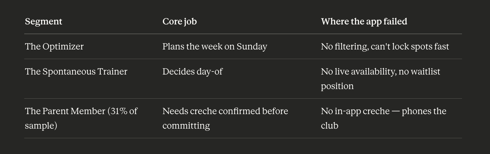
I started by analysing hundreds of App Store reviews across four markets - UK, South Africa, Italy, and Australia. The same themes came up in every region, which confirmed this was a product-level issue rather than anything localised. I followed that with an online survey of 80 members and video calls with 14 of them to understand the reasoning behind the patterns. Parents mentioned creche almost in passing - they'd stopped expecting the app to help with it. When the product team shared membership data, parents were leaving at 2.3× the rate of other members. That finding shaped the entire project scope.
A heuristic evaluation of the existing app surfaced 22 usability issues. The booking flow alone accounted for 9 of them.
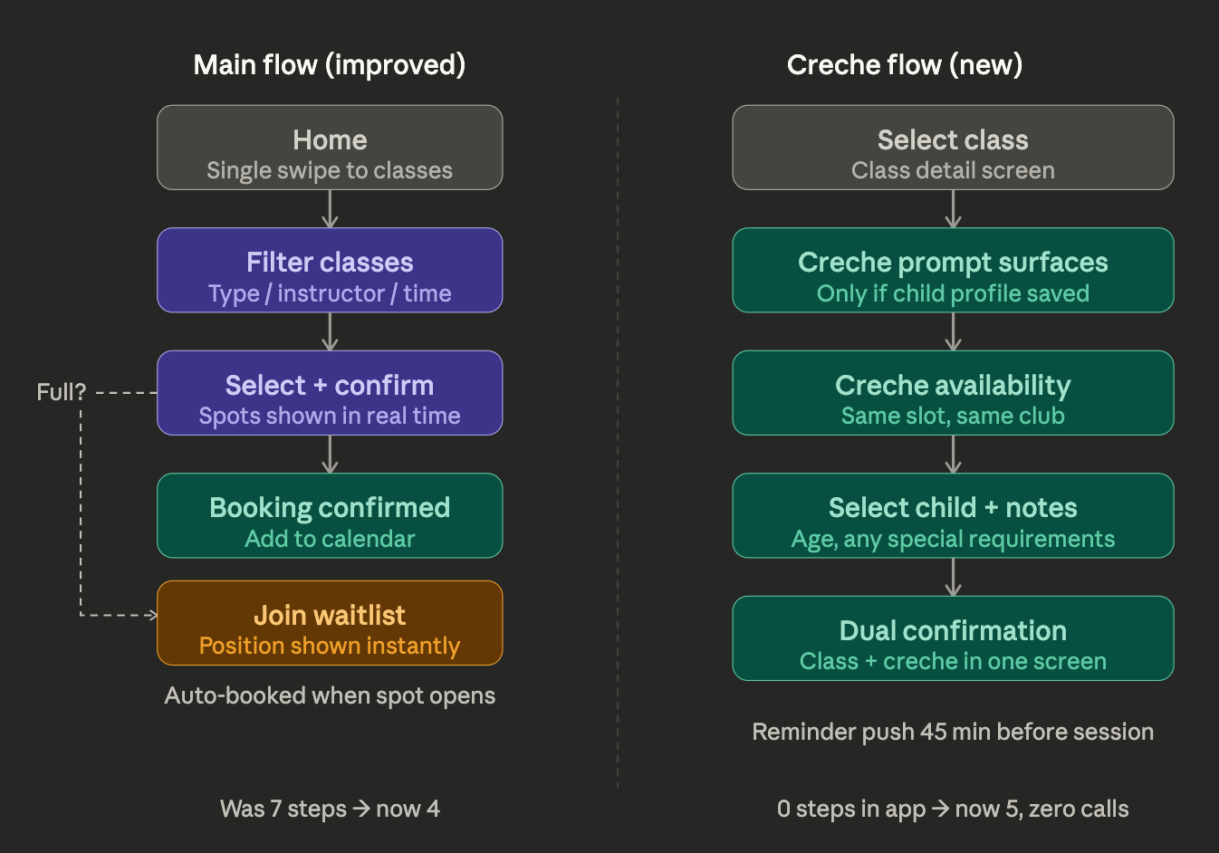
User flows
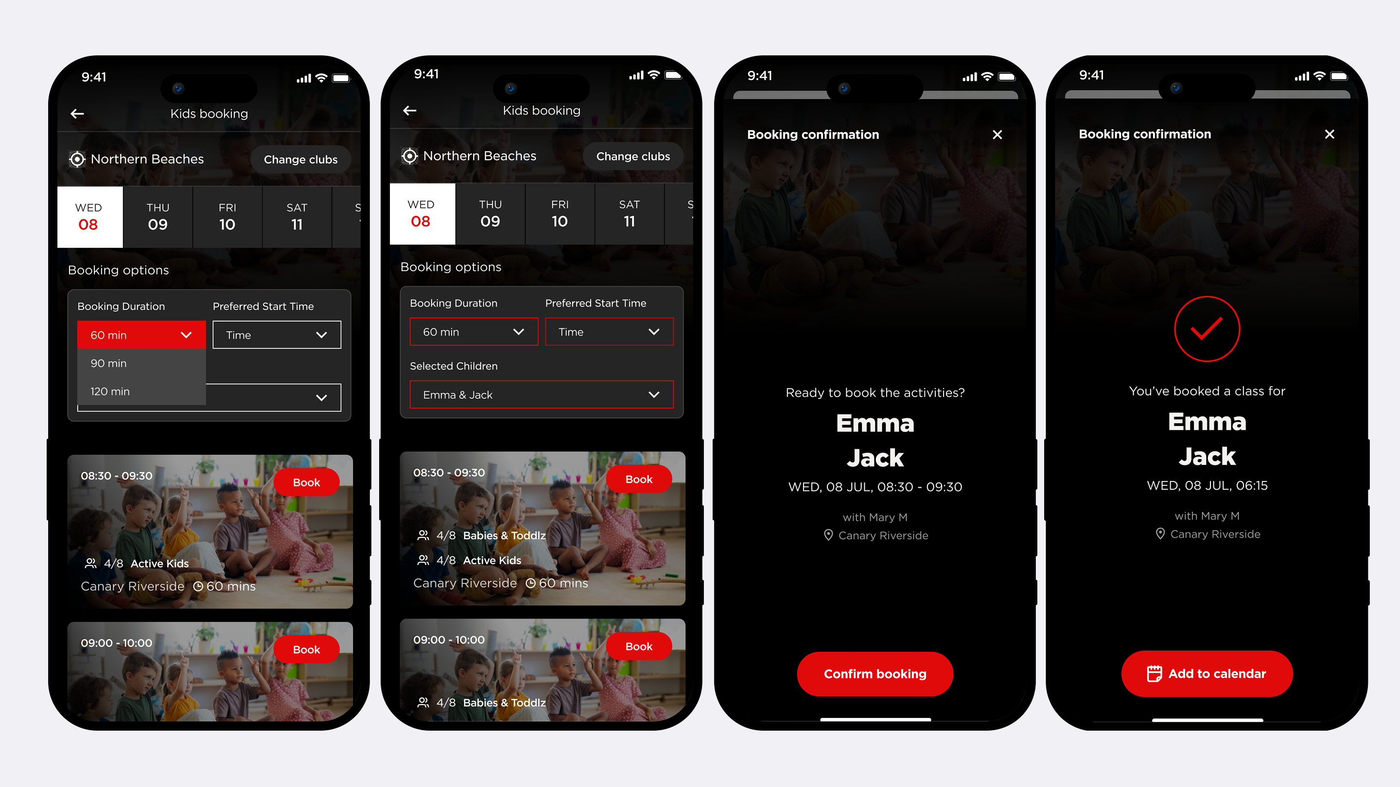
Booking restructured from 7 steps to 4. Creche added as a linked flow on the class detail screen - visible only to members with a saved child profile, completely absent for everyone else. Class and creche confirm together on a single screen.
Design system
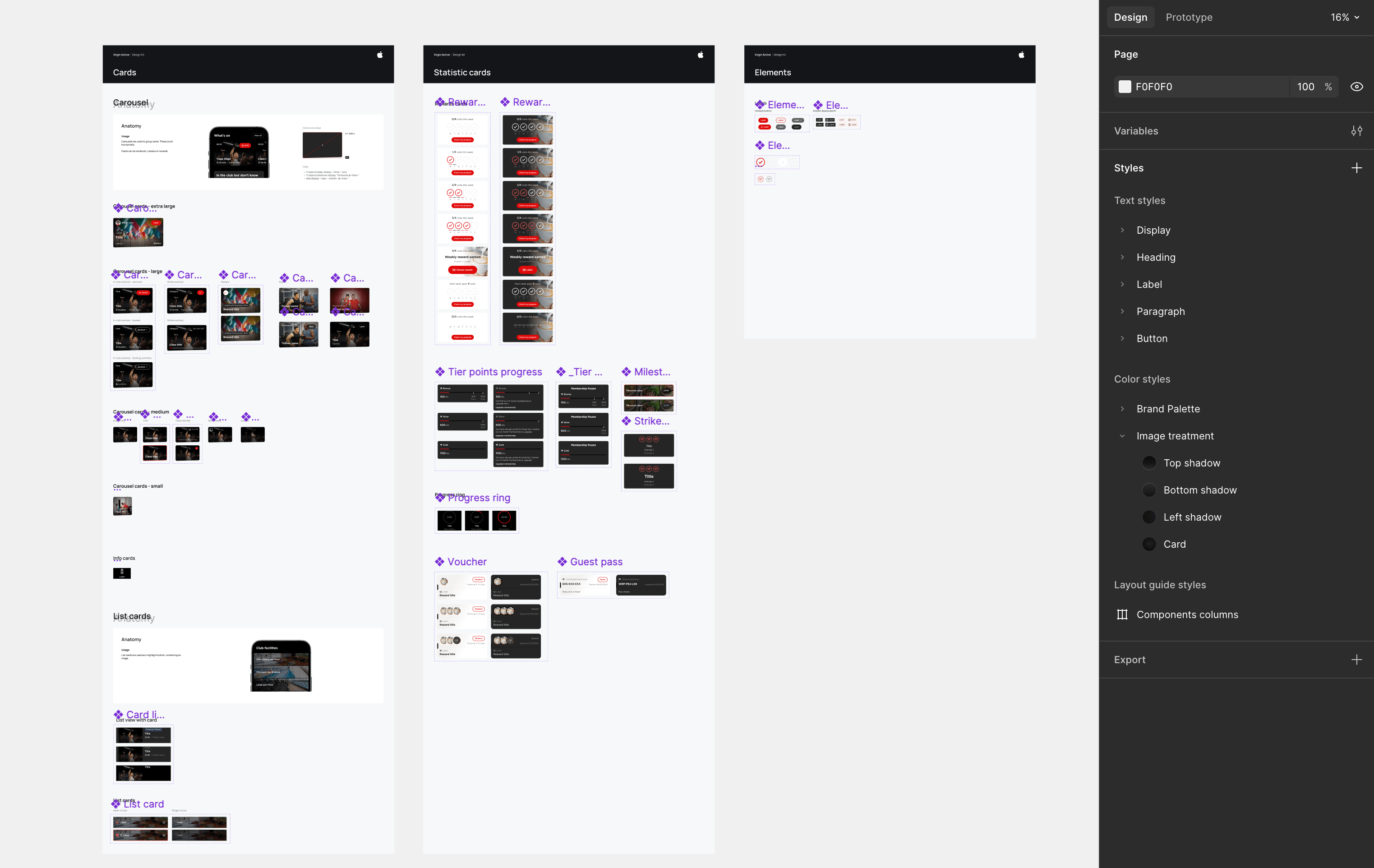
Worked within the existing visual language throughout. One new colour token introduced for family-related screens. Six components covered every new surface. The system was already strong — it just needed to be applied consistently.
Usability study
Remote moderated sessions with 8 members using a Figma mid-fi prototype. The creche prompt sat below the fold in the first round and two participants missed it. Moved above the booking CTA, retested - 8 from 8.
Numbers
Booking time −64%
SUS score 81.4 (was 61.2 · industry benchmark 68)
Creche task success rate 100% after one iteration
Parent churn driver addressed - 2.3× gap closed
Solution
Two flows rebuilt. A parent can now book a class and a creche spot in the same session without a single phone call. That outcome was the one worth getting right.

Portfolio
Risk & Compliance Platform

Finance & Invoicing App

Financial App
Virgin Active — Wellness & Fitness App · 235+ clubs · 8 countries
Your gym, your coach, your creche in one app. A world-class gym experience
The problem
Booking a class took 7 steps with no filtering, no waitlist visibility, and no real sense of whether a spot was available. Parents had an additional gap - creche had to be arranged separately, usually by calling the front desk. People had quietly accepted this as part of the process, which is always worth paying attention to.

The goal: Simplify the core booking flow and bring creche into the app as a proper, native feature - connected to the class booking rather than sitting outside it.
Research
I started by analysing hundreds of App Store reviews across four markets - UK, South Africa, Italy, and Australia. The same themes came up in every region, which confirmed this was a product-level issue rather than anything localised. I followed that with an online survey of 80 members and video calls with 14 of them to understand the reasoning behind the patterns. Parents mentioned creche almost in passing - they'd stopped expecting the app to help with it. When the product team shared membership data, parents were leaving at 2.3× the rate of other members. That finding shaped the entire project scope.
A heuristic evaluation of the existing app surfaced 22 usability issues. The booking flow alone accounted for 9 of them.
User flows
Booking restructured from 7 steps to 4. Creche added as a linked flow on the class detail screen - visible only to members with a saved child profile, completely absent for everyone else. Class and creche confirm together on a single screen.
Design system
Worked within the existing visual language throughout. One new colour token introduced for family-related screens. Six components covered every new surface. The system was already strong — it just needed to be applied consistently.
Usability study
Remote moderated sessions with 8 members using a Figma mid-fi prototype. The creche prompt sat below the fold in the first round and two participants missed it. Moved above the booking CTA, retested - 8 from 8.
Numbers
Booking time −64%
SUS score 81.4 (was 61.2 · industry benchmark 68)
Creche task success rate 100% after one iteration
Parent churn driver addressed - 2.3× gap closed
Solution
Two flows rebuilt. A parent can now book a class and a creche spot in the same session without a single phone call. That outcome was the one worth getting right.

Portfolio
Risk & Compliance Platform
Finance & Invoicing App
Financial App


Virgin Active — Wellness & Fitness App · 235+ clubs · 8 countries
Your gym, your coach, your creche in one app. A world-class gym experience
The problem
Booking a class took 7 steps with no filtering, no waitlist visibility, and no real sense of whether a spot was available. Parents had an additional gap - creche had to be arranged separately, usually by calling the front desk. People had quietly accepted this as part of the process, which is always worth paying attention to.
The goal: Simplify the core booking flow and bring creche into the app as a proper, native feature - connected to the class booking rather than sitting outside it.
Research
I started by analysing hundreds of App Store reviews across four markets - UK, South Africa, Italy, and Australia. The same themes came up in every region, which confirmed this was a product-level issue rather than anything localised. I followed that with an online survey of 80 members and video calls with 14 of them to understand the reasoning behind the patterns. Parents mentioned creche almost in passing - they'd stopped expecting the app to help with it. When the product team shared membership data, parents were leaving at 2.3× the rate of other members. That finding shaped the entire project scope.
A heuristic evaluation of the existing app surfaced 22 usability issues. The booking flow alone accounted for 9 of them.
User flows
Booking restructured from 7 steps to 4. Creche added as a linked flow on the class detail screen - visible only to members with a saved child profile, completely absent for everyone else. Class and creche confirm together on a single screen.
Design system
Worked within the existing visual language throughout. One new colour token introduced for family-related screens. Six components covered every new surface. The system was already strong — it just needed to be applied consistently.
Usability study
Remote moderated sessions with 8 members using a Figma mid-fi prototype. The creche prompt sat below the fold in the first round and two participants missed it. Moved above the booking CTA, retested - 8 from 8.
Numbers
Booking time −64%
SUS score 81.4 (was 61.2 · industry benchmark 68)
Creche task success rate 100% after one iteration
Parent churn driver addressed - 2.3× gap closed
Solution
Two flows rebuilt. A parent can now book a class and a creche spot in the same session without a single phone call. That outcome was the one worth getting right.
Portfolio
Risk & Compliance Platform
Finance & Invoicing App
Financial App
Virgin Active · Wellness & Fitness App · 235+ clubs · 8 countries
Your gym, your coach, your creche in one app. A world-class gym experience
The problem
Booking a class took 7 steps with no filtering, no waitlist visibility, and no real sense of whether a spot was available. Parents had an additional gap - creche had to be arranged separately, usually by calling the front desk. People had quietly accepted this as part of the process, which is always worth paying attention to.
The goal: Simplify the core booking flow and bring creche into the app as a proper, native feature - connected to the class booking rather than sitting outside it.
Research
I started by analysing hundreds of App Store reviews across four markets - UK, South Africa, Italy, and Australia. The same themes came up in every region, which confirmed this was a product-level issue rather than anything localised. I followed that with an online survey of 80 members and video calls with 14 of them to understand the reasoning behind the patterns. Parents mentioned creche almost in passing - they'd stopped expecting the app to help with it. When the product team shared membership data, parents were leaving at 2.3× the rate of other members. That finding shaped the entire project scope.
A heuristic evaluation of the existing app surfaced 22 usability issues. The booking flow alone accounted for 9 of them.
User flows
Booking restructured from 7 steps to 4. Creche added as a linked flow on the class detail screen - visible only to members with a saved child profile, completely absent for everyone else. Class and creche confirm together on a single screen.
Design system
Worked within the existing visual language throughout. One new colour token introduced for family-related screens. Six components covered every new surface. The system was already strong — it just needed to be applied consistently.
Usability study
Remote moderated sessions with 8 members using a Figma mid-fi prototype. The creche prompt sat below the fold in the first round and two participants missed it. Moved above the booking CTA, retested - 8 from 8.
Numbers
Booking time −64%
SUS score 81.4 (was 61.2 · industry benchmark 68)
Creche task success rate 100% after one iteration
Parent churn driver addressed - 2.3× gap closed
Solution
Two flows rebuilt. A parent can now book a class and a creche spot in the same session without a single phone call. That outcome was the one worth getting right.
Portfolio
Risk & Compliance Platform
Finance & Invoicing App
Financial App